Create a Google Play feature graphic with one clear idea
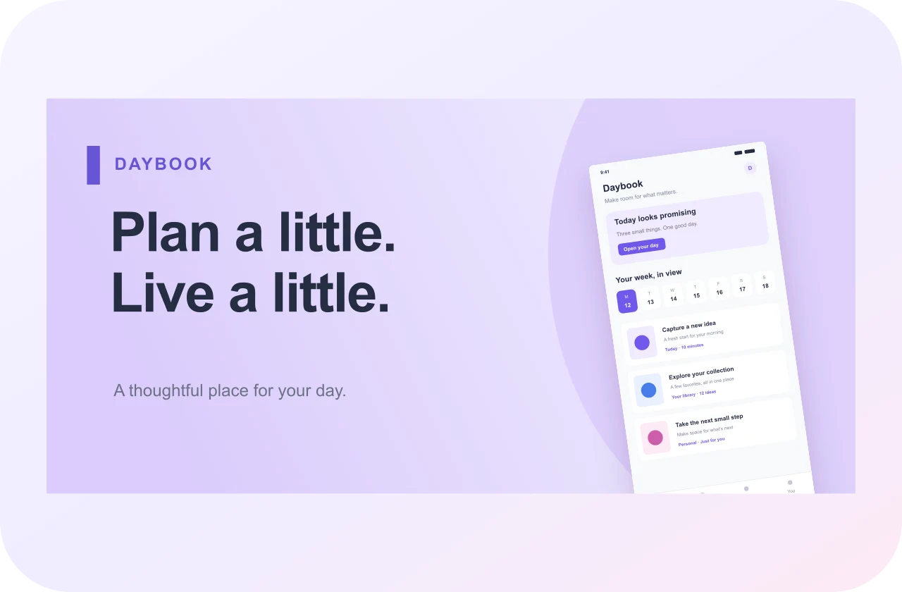
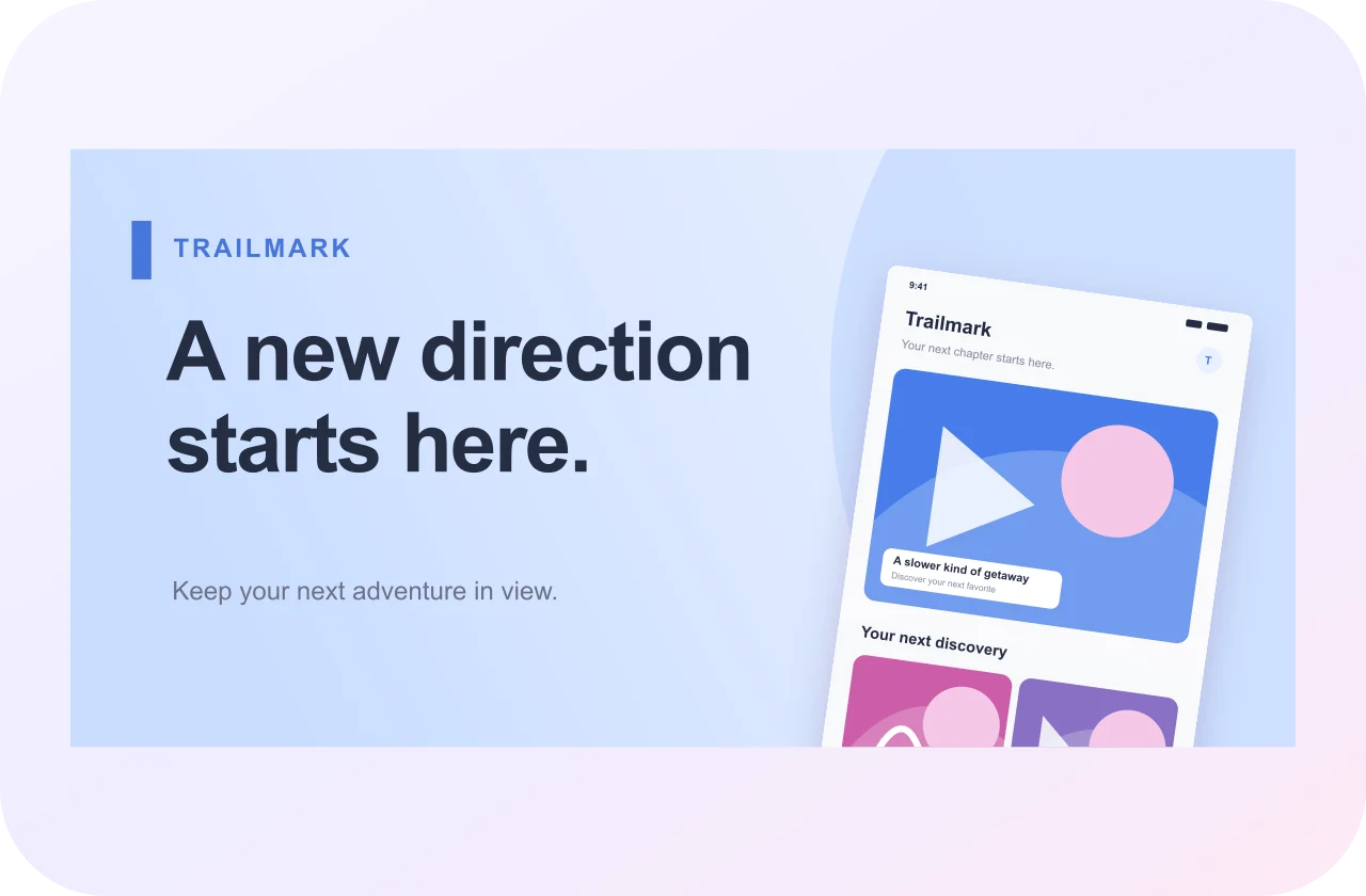
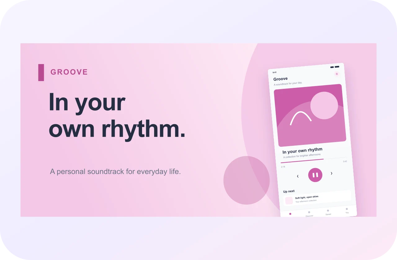
A Google Play feature graphic generator helps you design the wide promotional asset that accompanies your Android app listing. This graphic has a different job from a phone screenshot: it should introduce the product's character or central experience quickly. Choose one idea that can be expressed through a focused visual, a restrained caption and a background that supports the message.
Use AppScreenshot.online to arrange original images, editable text and shapes inside the required canvas. Start with a feature graphic template or build your own composition. Replace fictional sample material with artwork and interface content that accurately represent your app. Keep the design understandable without requiring someone to read small labels or interpret several unrelated scenes.
Start with the 1024 × 500 feature graphic canvas
This tool opens a 1024 × 500 output preset. Google's feature graphic requirements specify those dimensions and JPEG or 24-bit PNG without alpha. Check the current Play Console guidance before uploading. The standard export path produces opaque images, and the selected output size determines the downloaded file's dimensions independently of any decorative objects placed inside the design.
Keep feature graphic artwork separate from your portrait screenshot set. Cropping a finished phone panel into a short banner usually removes either the headline or the useful interface detail. Begin with the wide canvas so the arrangement can be designed for its actual proportions. Review the file dimensions after downloading instead of assuming an image that looks wide has the correct size.
Choose a visual that reflects your app's purpose
Identify the experience you want a first-time viewer to recognize. A language app might use a clear conversational scene, a planning app an organized weekly rhythm and a creative tool an expressive result. Choose relevant artwork with a strong focal point. Avoid assembling a collage of every feature just because the banner has more width than a phone screen.
Use your own images or material you have permission to include. Keep the visual style consistent with the app's identity, but adapt it to the banner rather than copying a small interface element at a much larger scale. If you include app content, select a recognizable part of the experience and give it enough space to be meaningful without magnifying tiny controls.
Use a simple hierarchy for a short, wide image
Begin with one dominant visual and add supporting elements only when they clarify the idea. A short banner has limited vertical space, so dense text and several competing focal points can make the message difficult to follow. Establish the order you want viewers to notice: the product experience, a concise explanation if needed and the surrounding visual identity.
Check the composition at several smaller display sizes. If the main subject becomes indistinct, simplify the background or remove secondary objects. Leave comfortable margins around essential content rather than relying on the outer edges of the image. Review the graphic in the destination's preview as well, where its placement or surrounding elements may change the apparent visual balance.
Write feature graphic text that supports the image
Use text when it makes the core experience easier to understand, not simply to fill an empty area. A few specific words can complement a clear image. A list of features or a long promotional paragraph usually asks too much of a compact banner. Keep any statement accurate for the app and easy to read against its background.
Consider the language and audience of the listing. A phrase that feels natural in one language may need a different line break or arrangement in another. Create and edit language versions manually, then review each one as a complete design. Do not assume that swapping words without changing spacing will preserve the same clarity or emphasis across every version.
Build the graphic with images, shapes and backgrounds
Add your artwork as an image layer, choose a background and use shapes to organize the composition. The editor's position, size and layer controls let you refine the relationship between these elements. Keep the screenshot or illustration proportional while adjusting its scale. Choose a simpler treatment when an added effect competes with the image's meaning.
Google's feature graphic guidance recommends avoiding device imagery and marketplace badges. Use a composition suited to the banner's role rather than automatically adding a phone frame. If you want framed promotional screenshots for a separate website placement, create them in another project. Keeping those designs separate helps you maintain appropriate artwork for each destination without repeatedly modifying one file.
Export one finished graphic and inspect the file
A blank editor project can contain several pages, but the feature graphic is a single delivery image. Work on the panel you intend to use and download that selected screenshot as PNG or JPEG. You can remove unused pages or keep variants for comparison. Avoid uploading a ZIP or a multi-panel screenshot sequence in place of the required feature graphic asset.
Open the exported file and verify 1024 × 500 dimensions, caption spelling and image clarity. Inspect it at full size and at a smaller banner scale. Then review the uploaded preview in Play Console. The generator prepares the composition; it does not publish it, submit it for review or guarantee that a particular design will be displayed in a promotional placement.
Maintain editable feature graphics for future campaigns
Download a JSON project backup after selecting the final version. Local drafts stay in the current browser, while a backup preserves the editable layers and imported images outside that browser. Keep the backup with the exported banner and source artwork. Identify the app version, language and campaign where useful, so the correct file is easy to retrieve later.
Review the feature graphic whenever the product's central experience or visual identity changes. Update artwork that no longer represents the app and reconsider any wording tied to an older release. Keep previous exports as a reference, but revise the layered source rather than trying to edit text inside a flattened image. This makes future size, language and message adjustments easier to manage.
Google Play feature graphic generator FAQs
Is a feature graphic the same as a screenshot?
No. It is a separate wide asset with its own dimensions and presentation purpose. Design it on the 1024 × 500 canvas, then prepare phone or tablet screenshots separately. Reusing a screenshot capture is possible, but the surrounding composition should be designed specifically for the banner.
Can I keep several graphic alternatives in one project?
Yes. You can use multiple pages as editable alternatives and export only the chosen panel. Keep each alternative at the required dimensions and inspect the selected download carefully. Save a JSON backup if you want to return to the alternatives after publishing the final graphic.